Accessibility Landmarks
Why
With landmarks, blind users using a screen reader have the ability to jump to sections of a web page.
What
In HTML there are some semantic elements that can be used to define different parts of a web page:
<header><nav><main><aside><section><footer>
How - Example from The White House
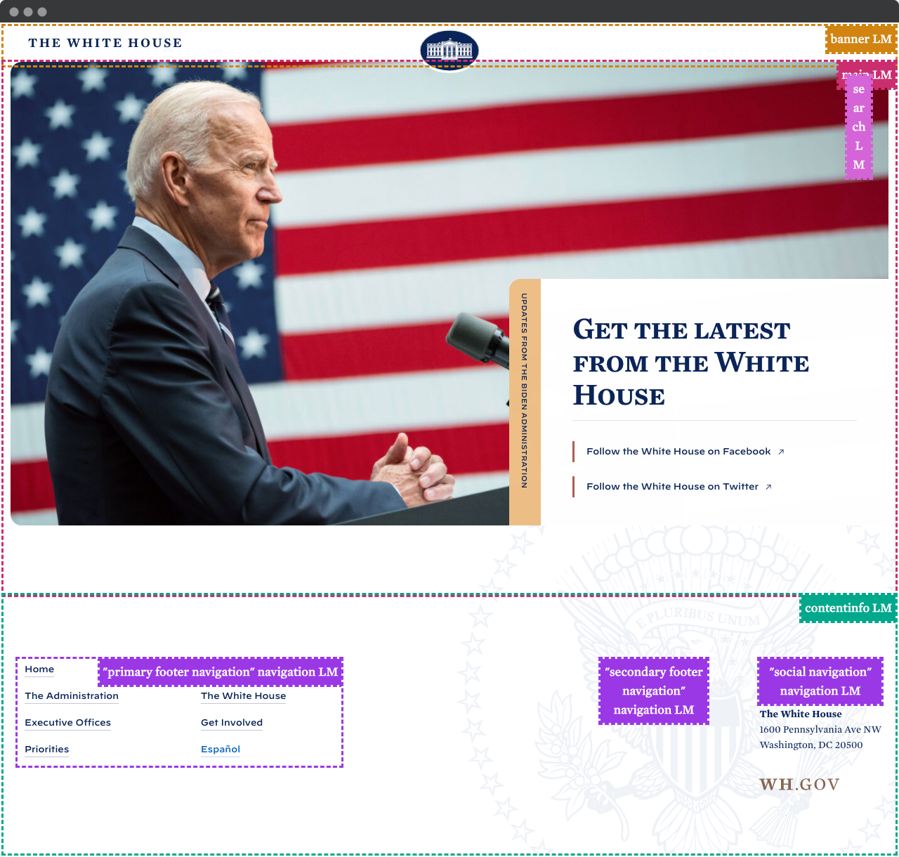
The front page of The White House is using landmarks. It consists of a <header> at the top, a <main> containing all the main content and a <footer> with some <nav> elements at the bottom.
One way to visualize landmarks is to use the tool Accessibility Insights. One of the features is that it highlights the landmarks, as we can see in the following screenshot.

Try it yourself. Download the browser extension Accessibility Insights and turn on the landmark visualization. Is your favorite site using landmarks?
Roles
But wait, it shows banner, contentinfo and navigation. This is a bit confusing. The reason is that each landmark element has a corresponding role. We have not talked about roles in this course so far. We will get back to this, but as a simplified explanation:
A <header> has a built in role of banner. This means that both <header>, <header role="banner"> and <div role="banner"> are more or less equivalent. For most cases, <header> will be sufficient.
The same is true for <nav>, which has role="navigation" built in. <main> is easier, it has role="main". And then we have <footer> with its role="contentinfo". Let us leave the roles for now.
More than one of each landmark
A rule of thumb is to only use one <main> per page. When we use more than one type of landmark, like multiple <nav>s like in this example, we must label each of them. This is done with the attribute aria-label.
In the footer of The White House, we have three <nav>s, each with an aria-label, like aria-label="social navigation". This means that a screen reader user can skip directly to the social navigation. A helping hand. Some will say that to use the wording "navigation" as a part of the label of a <nav> is redundant. There is no right and wrong, but aria-label="social" should be fine.
The <aside> and <section> tags
Ever since the landmarks were introduced to HTML, developers have been confused. Two of the elements that people find vaguely defined are <aside> and <section>. Let us try to clarify a bit. The big difference is that an <aside> is related to the main content and the <section> is not related.

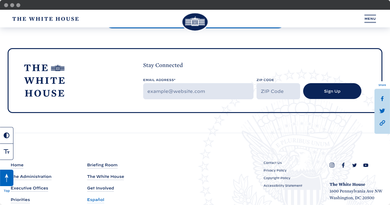
The contact page of The White House uses both an <aside> and a <section>. The three sharing buttons are inside an <aside>. This makes sense, they are related to the main content. If you use them, you will share the page you are on.
The Stay Connected is a <section>. Good. It is not related to the main content, and no other landmark will be
appropriate. One improvement that The White House can do with these landmarks is to add labels. This will be better for a screen reader user. <section aria-label="Newsletter"> and <aside aria-label="Share this page"> would be helpful.


